Whether you’re in the process of launching your first website or you’ve had one for yonks, make sure you don’t neglect your website navigation bar.
That’s right, the navigation bar.
You’re riveted already, right?
But here’s the thing, your nav bar has a huge role to play in the success of your website.
Make it easy to understand and visitors will click around in comfort. Cram it with shite or make it confusing, and they’ll jog on quicker than you can say, well, jog on.
So, keep reading to ensure you’re not making any mistakes or confusing your readers.
But first…
What is the website navigation bar?
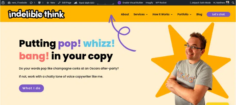
If you’re not massively tech-savvy. Or you leave your site stuff to a web developer, you might not know what a website navigation bar (or navigation menu as it’s also called) is. So, to explain, check out homepage below:
The navigation bar is the white strip at the top where the website links and the logo go (follow that massive arrow).
It’s the first thing visitors see when they land on your website, so it’s got to be clear and easy to understand and navigate.
But enough waffle, let’s crack on with optimising yours.
7 ways to optimise your website navigation bar.
Every website is different, so some nav bars will differ, which I’ll come to later. But for now, I’ll stick with how to lay out your menu so it kicks arse and converts:
One. Keep links to a minimum
Your website visitors are on your site to find out who you are and what you do, not read War & Peace. So, keep the number of links in your menu to a minimum – around 5 or 6 is the sweet spot.
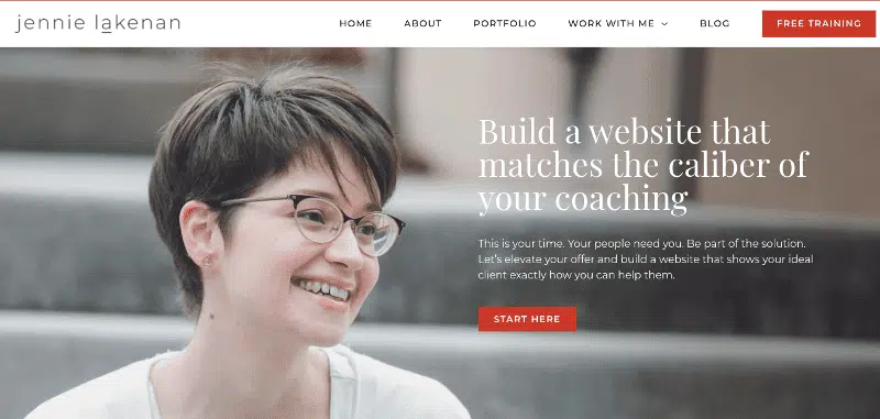
Web designer, Jennie Lakenan, hits the six sweet spot perfectly:
Jennie’s website navigation menu has just six links (with a drop-down menu, which I’ll mention later).
Clean, clear and straightforward.
It’s no wonder she’s so busy all the time!
Two. Arrange them in order of importance
When creating your navigation menu, think about how you’re trying to win over your customers by asking yourself:
- Do they already know what they want?
- Before closing a sale, do you need to let them get to know you first?
I find coaching websites are a great way to explain the differences depending on the audience, so:
A). A business owner whose clients already know what they want.
Although Jeanette Carter is a coach, she works with business leaders looking to make a significant impact in their roles. She’s a big name in her industry, and her clients already know what they want and need when they come to her. So, her website navigation menu is tailored to them.
Her clients want to know about courses and coaching and less about her.
For this reason, she doesn’t lead with her ‘About’ page.
B). A business owner whose clients need to get to know them first.
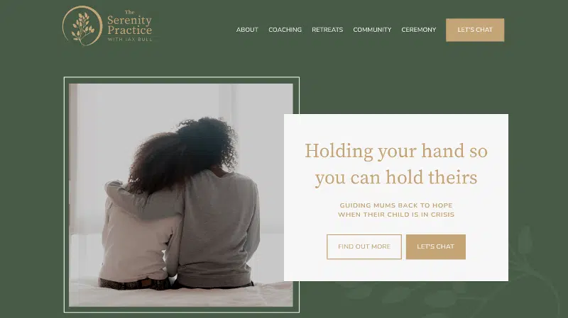
The navigation bar for The Serenity Practice with Jax Bull, however, takes a slightly different approach because she supports parents of children in crisis (i.e. kids who have severely poor mental health or have attempted suicide). Jax’s clients are in crisis, so she needs to start with her ‘About’ page.
Her clients need to know how she can support them through horrific circumstances. And by reading the story of how Jax has had to deal with her daughter’s suicide attempts, her audience will feel comforted and reassured.
***
The differences might look minor, but those differences are massive in giving their clients what they need first.
Also, the eye reads across a screen in a Z or F pattern (for more about this, check out my article, How to create a homepage that’ll improve your website traffic), which is why a navigation menu is vital. The human brain only really remembers the first and last items on the nav bar, so you put your most crucial link first and your call to action last.
Whether it’s:
- Let’s Chat (like Jax Bull and me)
- Free Training (like Jennie Lakenan)
- Book a Call (like Jeanette Carter)
Whatever action you want your visitors to take, stick it at the end.
Three. Link your logo to your homepage
It’s OK to have a ‘Home’ option in your website menu, but it’s not necessary these days. Most people expect your logo to link back to your homepage.
This frees up a space for other links on your nav bar.
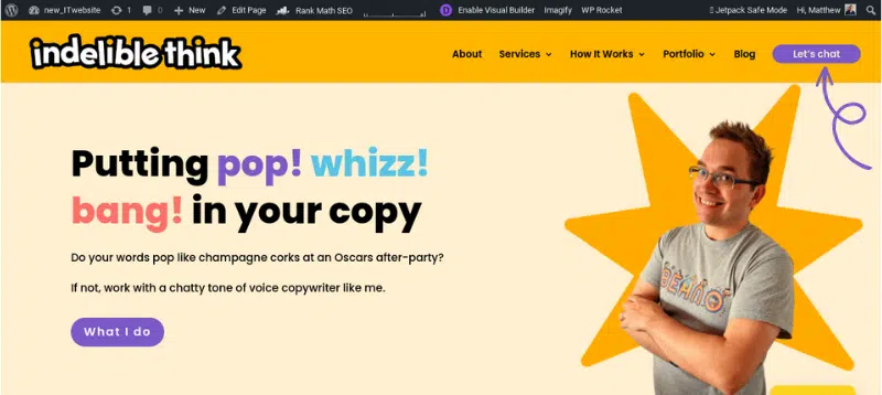
Four. Turn your CTA into a button
Like mine:
Turning your call to action into a button draws attention to what action you want your visitors to take.
So, how do you do it?
Well, I’ve got to be honest, it’s going to differ depending on your theme and all that gubbins. So, to make it easier for you, here is a list of YouTube tutorials that explain how you do it:
- Add button to WordPress navigation bar
- How to add a CTA Button to the Divi Menu (if you’re using a Divi theme)
- How to Add a Button to Your Header Navigation in Squarespace
It’s going to be different for everyone.
If you have a web designer or developer who created your site, get onto them and they’ll make these changes in minutes!
Five. Use easy-to-understand language
If you have a blog, call it a blog – or at a stretch, News.
Don’t call it ‘Musings’.
People expect to see certain things in a navigation bar. You might think putting something a bit random will intrigue somebody to click. It won’t. They won’t bother.
So, call pages what they are:
- About
- Services
- Testimonials
- Shop/Store
- Blog
Things like that.
Six. Use drop-down menus for subpages
If you have pages that relate to other pages, add them to a drop-down menu. And you can do this in different ways:
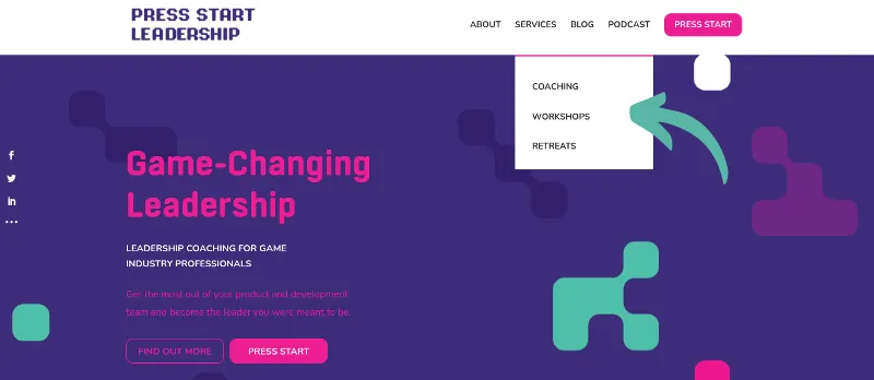
A). Single-line drop-down menu
Link Christopher does on his website, Press Start Leadership:
Using a drop-down menu like this, he can list his services without cramming everything across the nav menu. I list Testimonials under my Portfolio link. But you might want to talk about lots of different things on your About page.
So, you could split it into separate links that talk about:
- Your story
- Your values
- Company history
Try and list things that go together (so, obviously, don’t list your Services page under your About link!)
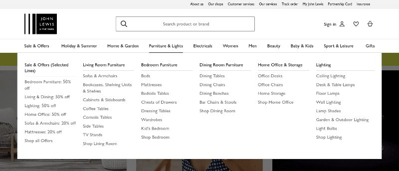
B). A mega drop-down menu
You’ll find these on eCommerce websites, so if you’re selling loads of products, you’re probably going to want a menu like this:
This is for John Lewis, but it pretty much counts for any eCommerce site you visit.
C). The hamburger
You tend to find these on mobile websites, but they’re becoming popular as navigation menus on desktop sites too.
Like energy experts, Inteb:
These are a real space saver and can give your pages a nice clean look. And when you click it, it opens into a wider menu.
I don’t have anything against hamburger menus, but I feel they can be confusing for some users. Inteb have been around for a good few years, and it certainly hasn’t damaged their conversion rate.
Seven. Add a search bar
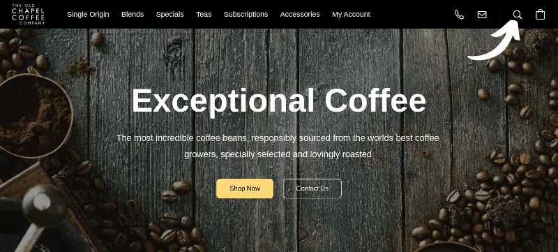
Yes, I’m a hypocrite, I don’t have one (mine kept going weird, and it was far too faffy that I gave up trying to get it fixed). Anyway, that shouldn’t stop you, like it hasn’t stopped The Old Chapel Coffee Company:
Adding a search bar to your website navigation menu makes it easy for visitors to search your site for something specific – fast. Not everybody wants to click around to find things. These are dead handy if you’re an eCommerce site because people can type in the product they’re looking for.
I could have just reused the John Lewis image above, but that’d be a bit boring.
Want more tips on how to get more website traffic?
Then check out my article, How to improve my website, it’s got thirteen dead useful tips in it.
Ready to tackle your nav bar?
Then what are you waiting for?
Your website navigation bar is one of the first things visitors see when landing on your site, so make sure it’s clean, clear and stands out.
Or, if you’re just looking to work with a tone of voice copywriter who can make you sound a little more human, then let’s chat.
Until next time,
Matt

